
Style Guide
Clean, attractive, styles to ensure consistency across your site.
Request Your Free Estimate Today!
This Style Guide is meant to make your life easier by providing clean, attractive, simple default styles for all of the most basic elements. It also provides guidelines for the way your website pages should be presented to ensure consistency across your site. To copy and paste code, hover over the code block and click the copy button.
Basic Styles
The basic building blocks of any website.
Modular Elements
Use these different modular Elements to contain the content on your page.
Fonts
Primary FontAa Overpass
Overpass is your primary font. Paragraphs and all text are in this font. If you need to assign this font, use the class .font-primary.*Available Weights: 300 - 900
Headings
Headings Are Important! Search engines use the headings to index the structure and content of your web pages and Users often skim a page by its headings. It is important to use headings to show the document structure.
Avoid skipping heading levels when structuring your document, as it confuses screen readers. For example, after using an <h2> in your code, the next heading used should be either <h2> or <h3>. If you need a heading to look bigger or smaller to match a specific style, use typescale classes to override the default size.
h1. This is a very large header
h2. This is a large header.
h3. This is a medium header.
h4. This is a moderate header.
h5. This is a small header.
h6. This is a tiny header.
 <h1>h1. This is a very large header.</h1>
 <h2>h2. This is a large header.</h2>
 <h3>h3. This is a medium header.</h3>
 <h4>h4. This is a moderate header.</h4>
 <h5>h5. This is a small header.</h5>
 <h6>h6. This is a tiny header.</h6>
Subtitles
If you insert a <small> element into a header it will scale the header font size down, allowing you to use this for subtitles or other secondary header text.
This is a large headerI am a subtitle
Lorem ipsum dolor sit amet, consectetur elit, sed do eiusmod tempor incididunt ut labore et dolore magna aliqua. Ut enim ad minim veniam, quis nostrud exercitation ullamco laboris nisi ut aliquip ex ea commodo consequat.
I am a subtitleThis is a medium header
Lorem ipsum dolor sit amet, consectetur elit, sed do eiusmod tempor incididunt ut labore et dolore magna aliqua. Ut enim ad minim veniam, quis nostrud exercitation ullamco laboris nisi ut aliquip ex ea commodo consequat.
<h2>This is a large header<small>I am a subtitle</small></h2>
<h3 class="text-center"><small>I am a subtitle</small>This is a medium header</h3>
Paragraphs
This is a paragraph. Paragraphs are preset with a font size [20px/1.25rem], line height [1.5] and vertical spacing [margin-bottom:24px/1.5rem] to match the overall vertical rhythm.
<p>This is a paragraph.</p>
Lead Paragraph
A slightly-larger-than-normal block of text, useful for intro blurbs or other descriptive text.
Lorem ipsum dolor sit amet consectetur adipisicing elit. In tempora ex officiis quos itaque fuga.
<p class="lead">Lorem ipsum dolor sit amet consectetur adipisicing elit. In tempora ex officiis quos itaque fuga.</p>
Basic Text Highlighting
HTML provides several formatting tags for highlighting text. Use the <strong> or <em> tag to denote text that should emphasized. Browsers will bold and italicize the words, while screen readers will read them with emphasis.
Other available tags:
- This is highlighted text
- This is smaller text
- This is subscript text.
- This is superscript text.
<strong>bolded text</strong>
<em>italicized text</em>
<strong><em>bolded & italicized</em></strong>
<mark>highlighted text</mark>
<small>smaller text</small>
<sub>subscript</sub>
<sup>superscript</sup>
Typescale
You may adjust font-size by overriding an element's default size with css classes. This can be useful to size a <p> or <h1> through <h6> using the existing header sizes.
Developer's Hint
Why would I want to adust font sizes like this?
It's important not to skip heading levels when structuring your document. It confuses screen readers. For example, after using an <h2> in your code, the next heading used should be either <h2> or <h3>. If you need a heading to look bigger or smaller to match a specific style, use CSS to override the default size.
Like h1 | Lorem Ipsum Dolor
Like h2 | Lorem Ipsum Dolor
Like h3 | Lorem Ipsum Dolor
Like h4 | Lorem Ipsum Dolor
Like h5 | Lorem Ipsum Dolor
Like h6 | Lorem Ipsum Dolor
<p class="like-h1">Lorem Ipsum Dolor</p>
<p class="like-h2">Lorem Ipsum Dolor</p>
<p class="like-h3">Lorem Ipsum Dolor</p>
<p class="like-h4">Lorem Ipsum Dolor</p>
<p class="like-h5">Lorem Ipsum Dolor</p>
<p class="like-h6">Lorem Ipsum Dolor</p>
Text Alignment
You may adjust the text alignment of an element by adding .text-left, .text-right, .text-center or .text-justify to an element.
Left Aligned Text
This the the standard alignment for text. Lorem ipsum dolor sit amet, consectetur adipiscing elit, sed do eiusmod tempor incididunt ut labore et dolore magna aliqua.
<p class="text-left">This the the standard alignment for text. Lorem ipsum dolor sit amet, consectetur adipiscing elit, sed do eiusmod tempor incididunt ut labore et dolore magna aliqua.</p>
Right Aligned Text
Lorem ipsum dolor sit amet, consectetur adipiscing elit, sed do eiusmod tempor incididunt ut labore et dolore magna aliqua. Ut enim ad minim veniam quis nostrud.
<p class="text-right">Lorem ipsum dolor sit amet, consectetur adipiscing elit, sed do eiusmod tempor incididunt ut labore et dolore magna aliqua. Ut enim ad minim veniam quis nostrud.</p>
Center Aligned Text
Lorem ipsum dolor sit amet, consectetur adipiscing elit, sed do eiusmod tempor incididunt ut labore et dolore magna aliqua. Ut enim ad minim veniam quis nostrud.
<p class="text-center">Lorem ipsum dolor sit amet, consectetur adipiscing elit, sed do eiusmod tempor incididunt ut labore et dolore magna aliqua. Ut enim ad minim veniam quis nostrud.</p>
Justify Text
Lorem ipsum dolor sit amet, consectetur adipiscing elit, sed do eiusmod tempor incididunt ut labore et dolore magna aliqua. Ut enim ad minim veniam quis nostrud.
<p class="text-justify">Lorem ipsum dolor sit amet, consectetur adipiscing elit, sed do eiusmod tempor incididunt ut labore et dolore magna aliqua. Ut enim ad minim veniam quis nostrud.</p>
Media Query Dependant Text Alignment
To adjust text alignment by breakpoint, add that breakpoint to the front of your text alignment class. For example, .md:text-center will keep text left-aligned on the smallest screens, but switch to center-aligned on medium screens and larger.
Text CenteredMedium and Up
This text is left aligned for small screens below 640 pixels and center aligned for screens 640 pixels and larger.
<p class="md:text-center">Lorem ipsum dolor sit amet, consectetur adipiscing elit, sed do eiusmod tempor incididunt ut labore et dolore magna aliqua. Ut enim ad minim veniam quis nostrud.</p>
Text RightLarge and Up
This text is left aligned for small screens below 640 pixels and right aligned for screens 1024 pixels and larger.
<p class="lg:text-right">Lorem ipsum dolor sit amet, consectetur adipiscing elit, sed do eiusmod tempor incididunt ut labore et dolore magna aliqua. Ut enim ad minim veniam quis nostrud.</p>
Text Centered / LeftLarge and Up
This text is centered for screens below 1024 pixels and left aligned for screens 1024 pixels and larger.
<p class="text-center lg:text-left">Lorem ipsum dolor sit amet, consectetur adipiscing elit, sed do eiusmod tempor incididunt ut labore et dolore magna aliqua. Ut enim ad minim veniam quis nostrud.</p>
Links
Links are styled with a bolder look in your primary color. This is an example of a link.
<a href="/">This is an example of a link</a>
Dividers
Use dividers to define breaks between paragraphs or sections.
Lorem ipsum dolor sit amet, consectetur adipiscing elit, sed do eiusmod tempor incididunt ut labore et dolore magna aliqua. Ut enim ad minim veniam quis nostrud.
Lorem ipsum dolor sit amet, consectetur adipiscing elit, sed do eiusmod tempor incididunt ut labore et dolore magna aliqua. Ut enim ad minim veniam quis nostrud.
<p>Lorem ipsum dolor sit amet, consectetur adipiscing elit, sed do eiusmod tempor incididunt ut labore et dolore magna aliqua. Ut enim ad minim veniam quis nostrud.</p>
<hr />
<p>Lorem ipsum dolor sit amet, consectetur adipiscing elit, sed do eiusmod tempor incididunt ut labore et dolore magna aliqua. Ut enim ad minim veniam quis nostrud.</p>
Lists
HTML lists are used to present list of information in a semantic way.
Unordered List - Basic
Use an unordered list to list things if the order of the items doesn't matter.
- Lorem ipsum dolor sit amet, consectetur adipiscing elit, sed do eiusmod tempor incididunt ut labore et dolore magna aliqua.
- Duis aute irure dolor in reprehenderit in voluptate velit esse cillum dolore eu fugiat nulla pariatur.
- Ut enim ad minim veniam, quis nostrud exercitation ullamco laboris nisi ut aliquip ex ea commodo consequat.
<ul>
   <li>List item number 1</li>
   <li>List item number 2</li>
   <li>List item number 3</li>
</ul>
Ordered List - Basic
Use an ordered list when creating a list where the order of the items is important, like ranking something from best to worst.
- Lorem ipsum dolor sit amet, consectetur adipiscing elit, sed do eiusmod tempor incididunt ut labore et dolore magna aliqua.
- Duis aute irure dolor in reprehenderit in voluptate velit esse cillum dolore eu fugiat nulla pariatur.
- Ut enim ad minim veniam, quis nostrud exercitation ullamco laboris nisi ut aliquip ex ea commodo consequat.
<ol>
   <li>List item number 1</li>
   <li>List item number 2</li>
   <li>List item number 3</li>
</ol>
Blockquote
"You gain strength, courage, and confidence by every experience in which you really stop to look fear in the face. You are able to say to yourself, 'I lived through this horror. I can take the next thing that comes along.'"
Eleanor Roosevelt
<blockquote>
   <p>"You gain strength, courage, and confidence by every experience in which you really stop to look fear in the face. You are able to say to yourself, 'I lived through this horror. I can take the next thing that comes along.'"</p>
   <cite>Eleanor Roosevelt</cite>
</blockquote>
Primary Color
#1197d5
RGB(17,151,213)
.color-primary.background-primary
Secondary Color
#11d2d5
RGB(17,210,213)
.color-secondary.background-secondary
Tertiary
#11d5b1
RGB(17,213,177)
.color-tertiary.background-tertiary
Base
#071932
RGB(7,25,50)
.color-base.background-base
Gray Accent
#1a2e4b
RGB(6,46,75)
.color-gray-accent.background-gray-accent
White
#fefefe
RGB(254,254,254)
.color-white.background-white
Black
#0a0a0a
RGB(10,10,10)
.color-black.background-black
Using the color classes to switch out font colors is simple. Just assign that color class to your tag.
Heading 5 in Primary Color
This paragraph has a font color change in the very middle.
<h5 class="color-primary">Heading 5 in Primary Color</h5>
<p>This paragraph has a <span class="color-secondary">font color change</span> in the very middle.</p>
Typography Styling
You have quite a few utility classes to style text. Let's use these helper classes to add additional styling to some headings.
Available Helper Classes
.uppercase | .lowercase | .titlecase | .sentencecase | .underline | .gradient-text
I Have All Uppercase Text.
Nope, I'd Rather be all Lowercase!
How About a Title that is Titlecased?
I display EXACTLY as I'm typed
This Title is Showing Underlined Text.
This Title is Showing Gradient Text.
<h3 class="uppercase">I Have All Uppercase Text.</h3>
<h3 class="lowercase">Nope, I'd Rather be all Lowercase!</h3>
<h3 class="titlecase">How About a Title that is Titlecased?</h3>
<h3 class="sentencecase">I display EXACTLY as I'm typed</h3>
<h3 class="underline">This Title is Showing Underlined Text.</h3>
<h3 class="gradient-text">This Title is Showing Gradient Text.</h3>
Weight Classes
In addition to the <strong> tag to bold text, you have several font weight classes to choose from. Note: These weight classes will only work if that weight is available in your font.
.weight300 light text | .weight400 normal text | .weight500 slightly bolded text | .weight600 semi-bolded text | .weight700 bolded text
Spacing
There are also many spacing classes available. The natural bottom margin for elements is 1rem [16px]. In addition to this, you have the following spacing classes:
Margins
Margins on Top and Bottom
.margin-y-0 no margin | .margin-y-050 0.5rem | .margin-y-075 0.75rem | .margin-y-100 1rem | .margin-y-125 1.25rem | .margin-y-150 1.5rem | .margin-y-200 2rem | .margin-y-300 3rem | .margin-y-400 4rem | .margin-y-500 5rem | .margin-y-600 6rem | .margin-y-800 8rem | .margin-y-1000 10rem | .margin-y-1100 11rem | .margin-y-1200 12rem | .margin-y-1300 13rem | .margin-y-1400 14rem | .margin-y-1500 15rem
Margins on Top
.margin-top-0 | .margin-top-050 | .margin-top-075 | .margin-top-100 | .margin-top-125 |.margin-top-150 | .margin-top-200 .margin-top-300 | .margin-top-400 | .margin-top-500 | .margin-top-600 | .margin-top-800 | .margin-top-1000 | .margin-top-1100 | .margin-top-1200 | .margin-top-1300 | .margin-top-1400 | .margin-top-1500
Margins on Bottom
.margin-bottom-0 | .margin-bottom-050 | .margin-bottom-075 | .margin-bottom-100 | .margin-bottom-125 |.margin-bottom-150 | .margin-bottom-200 | .margin-bottom-300 | .margin-bottom-400 | .margin-bottom-500 | .margin-bottom-600 | .margin-bottom-800 | .margin-bottom-1000 | .margin-bottom-1100 | .margin-bottom-1200 | .margin-bottom-1300 | .margin-bottom-1400 | .margin-bottom-1500
Padding
Padding on all Sides
.pad-0 no padding | .pad-050 0.5rem | .pad-075 0.75rem | .pad-100 1rem | .pad-125 1.25rem |.pad-150 1.5rem | .pad-200 2rem | .pad-300 3rem | .pad-400 4rem | .pad-500 5rem | .pad-600 6rem | .pad-800 8rem | .pad-1000 10rem | .pad-1100 11rem | .pad-1200 12rem | .pad-1300 13rem | .pad-1400 14rem | .pad-1500 15rem
Padding on Top and Bottom
.pad-y-0 | .pad-y-050 | .pad-y-075 | .pad-y-100 | .pad-y-125 | .pad-y-150 | .pad-y-200 | .pad-y-300 | .pad-y-400 | .pad-y-500 | .pad-y-600 | .pad-y-800 | .pad-y-1000 | .pad-y-1100 | .pad-y-1200 | .pad-y-1300 | .pad-y-1400 | .pad-y-1500
Padding on Top
.pad-top-0 | .pad-top-050 | .pad-top-075 | .pad-top-100 | .pad-top-125 |.pad-top-150 | .pad-top-200 .pad-top-300 | .pad-top-400 | .pad-top-500 | .pad-top-600 | .pad-top-800 | .pad-top-1000 | .pad-top-1100 | .pad-top-1200 | .pad-top-1300 | .pad-top-1400 | .pad-top-1500
Padding on Bottom
.pad-bottom-0 | .pad-bottom-050 | .pad-bottom-075 | .pad-bottom-100 | .pad-bottom-125 |.pad-bottom-150 | .pad-bottom-200 | .pad-bottom-300 | .pad-bottom-400 | .pad-bottom-500 | .pad-bottom-600 | .pad-bottom-800 | .pad-bottom-1000 | .pad-bottom-1100 | .pad-bottom-1200 | .pad-bottom-1300 | .pad-bottom-1400 | .pad-bottom-1500
Padding on Left and Right
.pad-x-0 | .pad-x-050 | .pad-x-075 | .pad-x-100 | .pad-x-125 |.pad-x-150 | .pad-x-200 | .pad-x-300 | .pad-x-400 | .pad-x-500 | .pad-x-600 | .pad-x-800 | .pad-x-1000 | .pad-x-1100 | .pad-x-1200 | .pad-x-1300 | .pad-x-1400 | .pad-x-1500
Padding on Left
.pad-left-0 | .pad-left-050 | .pad-left-075 | .pad-left-100 | .pad-left-125 |.pad-left-150 | .pad-left-200 | .pad-left-300 | .pad-left-400 | .pad-left-500 | .pad-left-600 | .pad-left-800 | .pad-left-1000 | .pad-left-1100 | .pad-left-1200 | .pad-left-1300 | .pad-left-1400 | .pad-left-1500
Padding on Right
.pad-right-0 | .pad-right-050 | .pad-right-075 | .pad-right-100 | .pad-right-125 |.pad-right-150 | .pad-right-200 | .pad-right-300 | .pad-right-400 | .pad-right-500 | .pad-right-600 | .pad-right-800 | .pad-right-1000 | .pad-right-1100 | .pad-right-1200 | .pad-right-1300 | .pad-right-1400 | .pad-right-1500
Responsive Spacing
If you would like your spacing to have different ratios on larger (desktop) viewports, use the above classing system with lg: added to it. For example, pad-y-100 would become lg:pad-y-100.
<section class="pad-y-300 lg:pad-y-1200">
  <p>Lorem ipsum dolor sit amet, consectetur adipiscing elit, sed do eiusmod tempor incididunt.</p>
</section>
Width Classes
.width20 | .width25 | .width33 | .width40 | .width50 | .width66 | .width75 | .width100
Height Classes
.height50 | .height100
Positioning Classes
.float-left | .float-right | .position-center
Box Shadows
.has-drop-shadow | .has-drop-shadow-long
Border Radius
.has-border-radius
Let's put some of those helper classes together to position and style images.
Image Floated Left 25% Width with Drop Shadow
 Sed ut perspiciatis unde omnis iste natus error sit voluptatem accusantium doloremque laudantium, totam rem aperiam, eaque ipsa quae ab illo inventore veritatis et quasi architecto beatae vitae dicta sunt explicabo.
<p><img class="float-left width25 has-drop-shadow" src="images/img-funny.jpg">Sed ut perspiciatis unde omnis iste natus error sit voluptatem accusantium doloremque laudantium, totam rem aperiam, eaque ipsa quae ab illo inventore veritatis et quasi architecto beatae vitae dicta sunt explicabo. Nemo enim ipsam voluptatem quia voluptas.</p>
Image Floated Right 50% Width with Border Radius
Sed ut perspiciatis unde omnis iste natus error sit voluptatem accusantium doloremque laudantium, totam rem aperiam, eaque ipsa quae ab illo inventore veritatis et quasi architecto beatae vitae dicta sunt explicabo.
<p><img class="float-right width50 has-border-radius" src="images/img-funny.jpg">Sed ut perspiciatis unde omnis iste natus error sit voluptatem accusantium doloremque laudantium, totam rem aperiam, eaque ipsa quae ab illo inventore veritatis et quasi architecto beatae vitae dicta sunt explicabo. Nemo enim ipsam voluptatem quia voluptas.</p>
Image Centered 75% Width with Drop Shadow and Border Radius
 Sed ut perspiciatis unde omnis iste natus error sit voluptatem accusantium doloremque laudantium, totam rem aperiam, eaque ipsa quae ab illo inventore veritatis et quasi architecto beatae vitae dicta sunt explicabo.
<p><img class="position-center width75 has-drop-shadow has-border-radius" src="images/img-funny2.jpg">Sed ut perspiciatis unde omnis iste natus error sit voluptatem accusantium doloremque laudantium, totam rem aperiam, eaque ipsa quae ab illo inventore veritatis et quasi architecto beatae vitae dicta sunt explicabo. Nemo enim ipsam voluptatem quia voluptas.</p>
To make an embedded video responsive, add the class .responsive-embed.widescreen to the containing tag.
<p class="responsive-embed widescreen">
   <iframe src="//www.youtube.com/embed/CmzKQ3PSrow" width="560" height="315" frameborder="0" allowfullscreen="allowfullscreen"></iframe>
</p>
Styled Videos
Use utility classes to style videos.
Responsive Video with Drop Shadow
 <p class="responsive-embed widescreen has-drop-shadow">
  <iframe width="560" height="315" src="https://www.youtube.com/embed/CmzKQ3PSrow" title="YouTube video player" frameborder="0" allow="accelerometer; autoplay; clipboard-write; encrypted-media; gyroscope; picture-in-picture; web-share" allowfullscreen></iframe>
 </p>
Responsive Video with Border Radius
 <p class="responsive-embed widescreen has-border-radius">
  <iframe width="560" height="315" src="https://www.youtube.com/embed/CmzKQ3PSrow" title="YouTube video player" frameborder="0" allow="accelerometer; autoplay; clipboard-write; encrypted-media; gyroscope; picture-in-picture; web-share" allowfullscreen></iframe>
 </p>
Use tables for tabular data.
| Header 1 | Header 2 |
|---|---|
| Item 1 | Item 2 |
| Item 1 | Item 2 |
| Item 1 | Item 2 |
| Item 1 | Item 2 |
| Item 1 | Item 2 |
| Footer 1 | Footer 2 |
 <table>
   <caption>Your Table Title</caption>
   <thead>
     <tr>
       <th>Header 1</th>
       <th>Header 2</th>
     </tr>
   </thead>
   <tbody>
     <tr>
       <td>Item 1</td>
       <td>Item 2</td>
     </tr>
     <tr>
       <td>Item 1</td>
       <td>Item 2</td>
     </tr>
     <tr>
       <td>Item 1</td>
       <td>Item 2</td>
     </tr>
     <tr>
       <td>Item 1</td>
       <td>Item 2</td>
     </tr>
     <tr>
       <td>Item 1</td>
       <td>Item 2</td>
     </tr>
   </tbody>
   <tfoot>
     <tr>
       <td>Footer 1</td>
       <td>Footer 2</td>
     </tr>
   </tfoot>
 </table>
Stacked Table
If you would like your table to stack on small screens, add the class .stack.
| Header 1 | Header 2 | Header 3 |
|---|---|---|
| Item 1 | Item 2 | Item 3 |
| Item 1 | Item 2 | Item 3 |
| Item 1 | Item 2 | Item 3 |
 <table class="stack">
 </table>
Scrolling Table
Got a lot of tubular tabular data? Add a wrapper element with the class .table-scroll around your table to enable horizontal scrolling.
| Rank | Name | Famous For | Best Comedic Role | Best Dramatic Role | Most Embarassing Movie | What Kind of Dog Would They Be |
|---|---|---|---|---|---|---|
| 1 | Chris Hemsworth | The MCU, The Cabin in the Woods | Thor in Thor: Ragnarok | Nicholas Hathaway in Blackhat | The Huntsman: Winter's War | Four-foot-tall labradoodle |
| 2 | Chris Evans | The MCU, Knives Out | Jake Wyler in Not Another Teen Movie | Curtis Everett in Snowpiercer | Push | Boston Terrier with a Husky |
| 3 | Chris Pine | Star Trek, Wonder Woman | Rex Hanson in Horrible Bosses 2 | Toby Howard in Hell or Highwater | This Means War | A Dalmatian |
| 4 | Chris Pratt | Guardians of the Galaxy | Andy Dwyer in Parks and Rec | Scott Hatteberg in Moneyball | Passengers | Golden Retriever |
 <div class="table-scroll">
   <table>
   </table>
 </div>
A basic button can be created using the .btn class.
If you'd like a button in an alternate color, add the class .btn-alt.
Standard Button
<a class="btn">Learn More</a>
Alternate Button
<a class="btn btn--alt">Learn More</a>
Button List
Button Lists are lists for related buttons. They're useful for when you need to display a group of buttons.
 <ul class="btn-list">
   <li class="btn-list__item"><a class="btn" href="/">Contact Us</a></li>
   <li class="btn-list__item"><a class="btn" href="/">314.822.3656</a></li>
   <li class="btn-list__item"><a class="btn" href="/">Email Us</a></li>
 </ul>
Center Aligned Button List
 <ul class="btn-list btn-list--align-center">
   <li class="btn-list__item"><a class="btn" href="/">Contact Us</a></li>
   <li class="btn-list__item"><a class="btn" href="/">314.822.3656</a></li>
   <li class="btn-list__item"><a class="btn" href="/">Email Us</a></li>
 </ul>
Icon Sprites
These icons are in an svg icon sprites file. They are utilized by using the <svg><use> pattern. Currently Empoweren strips out <svg> tags, so these can't be used in Empoweren unless in a custom include.
Search
Phone
YouTube
TikTok
X (Formerly Twitter)
Yelp
Foundation is the grid system framework that this site is built upon. It allows for easy responsive design.
The Basics
The grid is built using rows .row, and columns .column (or .columns). Basic percentage-based sizing is done using grid classes: .small-1 through .small-12, .medium-1 through .medium-12, and .large-1 through .large-12.
6 Columns
6 Columns
Small - 6 Columns
Medium - 4 Columns
Large - 2 Columns
Small - 6 Columns
Medium - 8 Columns
Large - 10 Columns
<div class="row">
  <div class="columns small-6">
    <p class="text-center">6 Columns</p>
  </div>
  <div class="columns small-6">
    <p class="text-center">6 Columns</p>
  </div>
</div>
<div class="row">
  <div class="columns small-6 medium-4 large-2">
    <p class="text-center">Small - 6 Columns<br />Medium - 4 Columns<br />Large - 2 Columns</p>
  </div>
  <div class="columns small-6 medium-8 large-10">
    <p class="text-center">Small - 6 Columns<br />Medium - 8 Columns<br />Large - 10 Columns</p>
  </div>
</div>
Advanced Sizing
If no sizing class is added to the column, it will simply expand to fill the leftover space.
4 columns
Whatever's left!
<div class="row">
  <div class="columns small-4">
    <p class="text-center">4 columns</p>
  </div>
  <div class="columns">
    <p class="text-center">Whatever's left!</p>
  </div>
</div>
Multiple expanding columns will share the leftover space equally.
4 columns
Whatever's left!
Whatever's left!
<div class="row">
  <div class="columns small-4">
  <p class="text-center">4 columns</p>
  </div>
  <div class="columns">
    <p class="text-center">Whatever's left!</p>
  </div>
  <div class="columns">
  <p class="text-center">Whatever's left!</p>
  </div>
</div>
A column can also be made to shrink, by adding the .shrink class. This means it will only take up the horizontal space its contents need.
Shrink!
Expand!
<div class="row">
  <div class="columns shrink">
    <p class="text-center">Shrink!</p>
  </div>
  <div class="columns">
    <p class="text-center">Expand!</p>
  </div>
</div>
Column Alignment
Columns can be aligned across the horizontal or vertical axis of their parent row.
Horizontal Alignment
Columns can be aligned the same way you would align text in a paragraph. By default, all columns align to the left, but this can be overridden with by adding the .align-[dir] class to the row.
Aligned to
the left
Aligned to
the right
Aligned to
the middle
Aligned to
the edges
Aligned to
the space around
<div class="row">
  <div class="column small-4">
    <p class="text-center">Aligned to</p>
  </div>
  <div class="column small-4">
    <p class="text-center">the left</p>
  </div>
</div>
<div class="row align-right">
  <div class="column small-4">
    <p class="text-center">Aligned to</p>
  </div>
  <div class="column small-4">
    <p class="text-center">the right</p>
  </div>
</div>
<div class="row align-center">
  <div class="column small-4">
    <p class="text-center">Aligned to</p>
  </div>
  <div class="column small-4">
    <p class="text-center">the middle</p>
  </div>
</div>
<div class="row align-justify">
  <div class="column small-4">
    <p class="text-center">Aligned to</p>
  </div>
  <div class="column small-4">
    <p class="text-center">the edges</p>
  </div>
</div>
<div class="row align-spaced">
  <div class="column small-4">
    <p class="text-center">Aligned to</p>
  </div>
  <div class="column small-4">
    <p class="text-center">the space around</p>
  </div>
</div>
.align-justify
A justified grid (justify-content: space-between) evenly distributes the space between each column. The first and last columns pin to the edge of the grid.
.align-spaced
A spaced grid (justify-content: space-around) evenly distributes the space around each column. This means there will always be space to the left of the first column, and to the right of the last column.
Vertical Alignment
By default, all columns in the grid stretch to be equal height. This behavior can be changed with vertical alignment classes.
Your options for vertical alignment are top, middle, bottom, and stretch.
Developer's Hint
Note that the word middle applies to vertical alignment, and center applies to horizontal alignment.
Applying a vertical alignment class to the row will affect every column directly inside it.
I'm in the middle!
I am as well, but I have so much text I take up more space! Lorem ipsum dolor sit amet, consectetur adipisicing elit. Quis facere ducimus earum minus, inventore, ratione doloremque deserunt neque perspiciatis accusamus explicabo soluta, quod provident distinctio aliquam omnis? Labore, ullam possimus.
<div class="row align-middle">
  <div class="columns">
    <p class="text-center">I'm in the middle!</p>
  </div>
  <div class="columns">
    <p class="text-center">I am as well, but I have so much text I take up more space! Lorem ipsum dolor sit amet, consectetur adipisicing elit. Quis facere ducimus earum minus, inventore, ratione doloremque deserunt neque perspiciatis accusamus explicabo soluta, quod provident distinctio aliquam omnis? Labore, ullam possimus.</p>
  </div>
</div>
These columns align to the top.
Lorem ipsum dolor sit amet, consectetur adipisicing elit. Voluptatum, tempora. Impedit eius officia possimus laudantium? Molestiae eaque, sapiente atque doloremque placeat! In sint, fugiat saepe sunt dolore tempore amet cupiditate.
<div class="row align-top">
  <div class="columns">
    <p class="text-center">These columns align to the top.</p>
  </div>
  <div class="columns">
    <p class="text-center">Lorem ipsum dolor sit amet, consectetur adipisicing elit. Voluptatum, tempora. Impedit eius officia possimus laudantium? Molestiae eaque, sapiente atque doloremque placeat! In sint, fugiat saepe sunt dolore tempore amet cupiditate.</p>
  </div>
</div>
Vertical Alignment of child columns (individually)
Similar alignment classes can also be applied to individual columns, which use the format .align-self-* instead of .align-*.
Align bottom
Align middle
Align top
Lorem ipsum dolor sit amet, consectetur adipisicing elit. Non harum laborum cum voluptate vel, eius adipisci similique dignissimos nobis at excepturi incidunt fugit molestiae quaerat, consequuntur porro temporibus. Nisi, ex?
<div class="row">
  <div class="column align-self-bottom">
    <p class="text-center">Align bottom</p>
  </div>
  <div class="column align-self-middle">
    <p class="text-center">Align middle</p>
  </div>
  <div class="column align-self-top">
    <p class="text-center">Align top</p>
  </div>
  <div class="column">
    <p class="text-center">Lorem ipsum dolor sit amet, consectetur adipisicing elit. Non harum laborum cum voluptate vel, eius adipisci similique dignissimos nobis at excepturi incidunt fugit molestiae quaerat, consequuntur porro temporibus. Nisi, ex?</p>
  </div>
</div>
A Modal Dialog is an empty container, so you can put any kind of content inside it, from text to forms to a video.
To create a modal, you need two things: a link to open the modal, and the modal itself.
To create the modal, add the class .reveal, the attribute data-reveal, and a unique ID to a container. To create a link to open the modal, add the attribute data-open to any element. The value of data-open should be the ID of the modal.
Dr. Seuss was a Genius
"You have brains in your head. You have feet in your shoes. You can steer yourself any direction you choose. You're on your own. And you know what you know. And YOU are the one who'll decide where to go..."
<p><a class="btn" data-open="samplePopup">Modal Dialog</a></p>
<div class="reveal" id="samplePopup" data-reveal data-reset-on-close="true">
<h3>Dr. Seuss was a Genius</h3>
<p>"You have brains in your head. You have feet in your shoes. You can steer yourself any direction you choose. You're on your own. And you know what you know. And YOU are the one who'll decide where to go..."</p>
<button class="close-button" data-close aria-label="Close modal" type="button"><span aria-hidden="true">×</span></button>
</div>
Modal Dialog with Video
A common pattern, creating a Modal with a video is pretty simple. Add the class .reveal--video-modal to the Modal and add the class .close-button--for-video-modal to the Modal close button.
This is also utilizing the embedded reponsive video pattern.
<p><a class="btn" data-open="videoSample">I open a video Modal</a></p>
<div class="reveal reveal--video-modal" id="videoSample" data-reveal data-reset-on-close="true">
<p class="responsive-embed widescreen">
<iframe width="560" height="315" src="https://www.youtube.com/embed/CmzKQ3PSrow" title="YouTube video player" frameborder="0" allow="accelerometer; autoplay; clipboard-write; encrypted-media; gyroscope; picture-in-picture; web-share" allowfullscreen></iframe>
</p>
<button class="close-button close-button--for-video-modal" data-close aria-label="Close modal" type="button"><span aria-hidden="true">×</span></button>
</div>
Content Block - Basic
Lorem ipsum dolor sit amet
Lorem ipsum dolor, sit amet consectetur adipisicing elit. Tenetur harum aliquid ipsum? Eum, beatae labore corporis rem iste quo harum sapiente numquam magni.
 <section class="content-block">
   <h3>Lorem ipsum dolor sit amet</h3>
   <p>Lorem ipsum dolor, sit amet consectetur adipisicing elit. Tenetur harum aliquid ipsum? Eum, beatae labore corporis rem iste quo harum sapiente numquam magni.</p>
 </section>
Content Block - Glow Treatment
Lorem ipsum dolor sit amet
Lorem ipsum dolor, sit amet consectetur adipisicing elit. Tenetur harum aliquid ipsum? Eum, beatae labore corporis rem iste quo harum sapiente numquam magni.
Lorem ipsum dolor sit amet
Lorem ipsum dolor, sit amet consectetur adipisicing elit. Tenetur harum aliquid ipsum? Eum, beatae labore corporis rem iste quo harum sapiente numquam magni.
Lorem ipsum dolor sit amet
Lorem ipsum dolor, sit amet consectetur adipisicing elit. Tenetur harum aliquid ipsum? Eum, beatae labore corporis rem iste quo harum sapiente numquam magni.
 <div class="row small-up-1 medium-up-2 large-up-3">
   <div class="columns small-12 large-4">
     <section class="content-block content-block--glow-001">
       <h3>Lorem ipsum dolor sit amet</h3>
       <p>Lorem ipsum dolor, sit amet consectetur adipisicing elit. Tenetur harum aliquid ipsum? Eum, beatae labore corporis rem iste quo harum sapiente numquam magni.</p>
     </section>
   </div>
   <div class="columns small-12 large-4">
     <section class="content-block content-block--glow-002">
       <h3>Lorem ipsum dolor sit amet</h3>
       <p>Lorem ipsum dolor, sit amet consectetur adipisicing elit. Tenetur harum aliquid ipsum? Eum, beatae labore corporis rem iste quo harum sapiente numquam magni.</p>
     </section>
   </div>
   <div class="columns small-12 large-4">
     <section class="content-block content-block--glow-003">
       <h3>Lorem ipsum dolor sit amet</h3>
       <p>Lorem ipsum dolor, sit amet consectetur adipisicing elit. Tenetur harum aliquid ipsum? Eum, beatae labore corporis rem iste quo harum sapiente numquam magni.</p>
     </section>
   </div>
 </div>
Content Blocks - Reviews
Pleased with the price, the professionalism and speed.
Jeff C.
Responsive, good communication, hard workers and they do an awesome job!
Carson M.
We are so impressed with the quality of work.
Tabitha H.
 <div class="row small-up-1 large-up-3 align-middle">
   <div class="columns">
     <div class="content-block content-block--glow-002">
       <blockquote class="quote-secondary quote-review quote-review--secondary">
         <p class="lead weight500">Pleased with the price, the professionalism and speed.</p>
         <cite>Jeff C.</cite>
       </blockquote>
     </div>
   </div>
   <div class="columns">
     <div class="content-block content-block--glow-001">
       <blockquote class="quote-review">
         <p class="lead weight500">Responsive, good communication, hard workers and they do an awesome job!</p>
         <cite>Carson M.</cite>
       </blockquote>
     </div>
   </div>
   <div class="columns">
     <div class="content-block content-block--glow-003">
       <blockquote class="quote-tertiary quote-review quote-review--tertiary">
         <p class="lead weight500">We are so impressed with the quality of work.</p>
         <cite>Tabitha H.</cite>
       </blockquote>
     </div>
   </div>
 </div>
 <div class="gallery-collage">
  <!-- Use Empoweren's WYSIWYG to insert gallery here -->
 </div>

From SeaBee to Master Mason
McMaster Contracting was founded by Andrew McMaster. Frustrated with the decline of the masonry industry, he formed his company to fill the gap between quality masonry and low bottom bids. He was convinced he could offer both quality masonry services and affordable prices.
Andy served in the US Navy for 4 years as a SeaBee, gaining valuable experience with all types of contruction, but his passion remained with masonry. Upon his return to civilian life, he became a Union Hod Carrier in the Local 110 Labors. After proving himself a valuable asset, he became a Union Bricklayer. 17 years later, the man who started off as a humble Hod Carrier is now the owner and founder of a successful masonry business.
 <div class="media-block">
   <div class="row align-middle align-justify row--media-block">
     <div class="columns small-12 large-6 large-order-2 columns--media-block">
       <section class="media-block__media">
         <img class="media-block__img has-drop-shadow" src="cmss_files/imagelibrary/media-blocks/media-block-andy-hike-001-760x538.jpg" alt="" width="760" height="538" />
       </section>
     </div>
     <div class="columns small-12 large-6 large-order-1 columns--media-block">
       <section class="media-block__content">
         <h3 class="text-center lg:text-left">From SeaBee to <strong>Master Mason</strong></h3>
         <p>McMaster Contracting was founded by Andrew McMaster. Frustrated with the decline of the masonry industry, he formed his company to fill the gap between quality masonry and low bottom bids. He was convinced he could offer both quality masonry services and affordable prices.</p>
         <p>Andy served in the US Navy for 4 years as a SeaBee, gaining valuable experience with all types of contruction, but his passion remained with masonry. Upon his return to civilian life, he became a Union Hod Carrier in the Local 110 Labors. After proving himself a valuable asset, he became a Union Bricklayer. 17 years later, the man who started off as a humble Hod Carrier is now the owner and founder of a successful masonry business.</p>
       </section>
     </div>
   </div>
 </div>
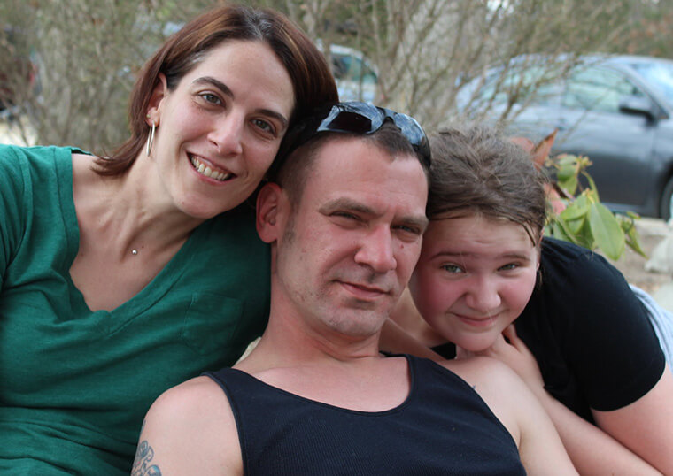
Grounded in Family
Andy is a proud and devoted family man to his wife and three children. He is an avid rose lover and can often be found wandering around the garden taking care of his beautiful rose bushes. Andy loves being outdoors, enjoying the beauty of some of Missouri's most remote areas. His military background has given him the mental and physical discipline needed to keep up with his passion for backpacking and wilderness survival skills.
This rigid discipline has also given Andy the experience needed to not only make McMaster Contracting the thriving business it is today, but to bring it in to the 21st Century by being the first in Missouri to offer Green Masonry Products.
 <div class="media-block">
   <div class="row align-middle align-justify row--media-block">
     <div class="columns small-12 large-6 columns--media-block">
       <section class="media-block__media">
         <img class="media-block__img has-drop-shadow" src="cmss_files/imagelibrary/media-blocks/media-block-andy-family-001-760x538.jpg" alt="" width="760" height="538" />
       </section>
     </div>
     <div class="columns small-12 large-6 columns--media-block">
       <section class="media-block__content">
         <h3 class="text-center lg:text-left">Grounded in <strong>Family</strong></h3>
         <p>Andy is a proud and devoted family man to his wife and three children. He is an avid rose lover and can often be found wandering around the garden taking care of his beautiful rose bushes. Andy loves being outdoors, enjoying the beauty of some of Missouri's most remote areas. His military background has given him the mental and physical discipline needed to keep up with his passion for backpacking and wilderness survival skills.</p>
         <p>This rigid discipline has also given Andy the experience needed to not only make McMaster Contracting the thriving business it is today, but to bring it in to the 21st Century by being the first in Missouri to offer Green Masonry Products.</p>
       </section>
     </div>
   </div>
 </div>
Panel | Basic
Fullwidth panel with text overlayed on a colored background.
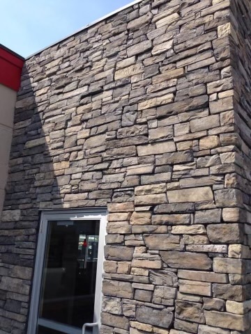
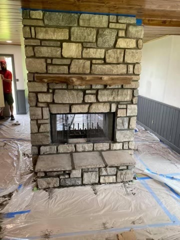
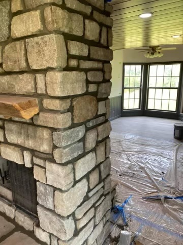
Masonry Restoration & Repair
Our team of skilled craftsman combines traditional techniques with innovative solutions to address every aspect of restoration, from power washing and delicate tuck pointing to comprehensive structural reinforcement. Whether it's a historical landmark or a residential treasure, we pride ourselves on delivering meticulous results that exceed expectations, ensuring the longevity and beauty of every project we undertake.
<div class="panel background-gray-accent pad-top-300 lg:pad-top-600 pad-bottom-200 lg:pad-bottom-500">
<div class="row align-center">
<div class="columns small-12 large-10">
<h2 class="text-center lg:text-left">Masonry <strong class="gradient-text">Restoration & Repair</strong></h2>
<p>Our team of skilled craftsman combines traditional techniques with innovative solutions to address every aspect of restoration, from power washing and delicate tuck pointing to comprehensive structural reinforcement. Whether it's a historical landmark or a residential treasure, we pride ourselves on delivering meticulous results that exceed expectations, ensuring the longevity and beauty of every project we undertake.</p>
<p class="text-center lg:text-left"><a class="btn" href="contact-us.html">Request Your Free Estimate Today</a></p>
</div>
</div>
</div>
Panels | With Stylized Dots Backgrounds
If you would like to add a stylized dots background to the top of your basic panel, add the class .panel--bg-dots-top.
Masonry Restoration & Repair
Our team of skilled craftsman combines traditional techniques with innovative solutions to address every aspect of restoration, from power washing and delicate tuck pointing to comprehensive structural reinforcement. Whether it's a historical landmark or a residential treasure, we pride ourselves on delivering meticulous results that exceed expectations, ensuring the longevity and beauty of every project we undertake.
<div class="panel panel--bg-dots-top pad-top-300 lg:pad-top-600 pad-bottom-200 lg:pad-bottom-500">
<div class="row align-center">
<div class="columns small-12 large-10">
<h2 class="text-center lg:text-left">Masonry <strong class="gradient-text">Restoration & Repair</strong></h2>
<p>Our team of skilled craftsman combines traditional techniques with innovative solutions to address every aspect of restoration, from power washing and delicate tuck pointing to comprehensive structural reinforcement. Whether it's a historical landmark or a residential treasure, we pride ourselves on delivering meticulous results that exceed expectations, ensuring the longevity and beauty of every project we undertake.</p>
<p class="text-center lg:text-left"><a class="btn" href="contact-us.html">Request Your Free Estimate Today</a></p>
</div>
</div>
</div>
If you would like to add a stylized dots background to the bottom of your basic panel, add the class .panel--bg-dots-bottom.
Masonry Restoration & Repair
Our team of skilled craftsman combines traditional techniques with innovative solutions to address every aspect of restoration, from power washing and delicate tuck pointing to comprehensive structural reinforcement. Whether it's a historical landmark or a residential treasure, we pride ourselves on delivering meticulous results that exceed expectations, ensuring the longevity and beauty of every project we undertake.
<div class="panel panel--bg-dots-bottom pad-top-300 lg:pad-top-600 pad-bottom-200 lg:pad-bottom-500">
<div class="row align-center">
<div class="columns small-12 large-10">
<h2 class="text-center lg:text-left">Masonry <strong class="gradient-text">Restoration & Repair</strong></h2>
<p>Our team of skilled craftsman combines traditional techniques with innovative solutions to address every aspect of restoration, from power washing and delicate tuck pointing to comprehensive structural reinforcement. Whether it's a historical landmark or a residential treasure, we pride ourselves on delivering meticulous results that exceed expectations, ensuring the longevity and beauty of every project we undertake.</p>
<p class="text-center lg:text-left"><a class="btn" href="contact-us.html">Request Your Free Estimate Today</a></p>
</div>
</div>
</div>
If you would like to add a stylized dots background to the top and bottom of your basic panel, add the class .panel--bg-dots-top-bottom.
Masonry Restoration & Repair
Our team of skilled craftsman combines traditional techniques with innovative solutions to address every aspect of restoration, from power washing and delicate tuck pointing to comprehensive structural reinforcement. Whether it's a historical landmark or a residential treasure, we pride ourselves on delivering meticulous results that exceed expectations, ensuring the longevity and beauty of every project we undertake.
<div class="panel panel--bg-dots-top-bottom pad-top-300 lg:pad-top-600 pad-bottom-200 lg:pad-bottom-500">
<div class="row align-center">
<div class="columns small-12 large-10">
<h2 class="text-center lg:text-left">Masonry <strong class="gradient-text">Restoration & Repair</strong></h2>
<p>Our team of skilled craftsman combines traditional techniques with innovative solutions to address every aspect of restoration, from power washing and delicate tuck pointing to comprehensive structural reinforcement. Whether it's a historical landmark or a residential treasure, we pride ourselves on delivering meticulous results that exceed expectations, ensuring the longevity and beauty of every project we undertake.</p>
<p class="text-center lg:text-left"><a class="btn" href="contact-us.html">Request Your Free Estimate Today</a></p>
</div>
</div>
</div>
Panels | With Branding Mark
If you would like to add a stylized branding mark to your basic panel, add the class .panel--logo-mark.
Masonry Restoration & Repair
Our team of skilled craftsman combines traditional techniques with innovative solutions to address every aspect of restoration, from power washing and delicate tuck pointing to comprehensive structural reinforcement. Whether it's a historical landmark or a residential treasure, we pride ourselves on delivering meticulous results that exceed expectations, ensuring the longevity and beauty of every project we undertake.
<div class="panel panel--logo-mark pad-top-300 lg:pad-top-600 pad-bottom-200 lg:pad-bottom-500">
<div class="row align-center">
<div class="columns small-12 large-10">
<h2 class="text-center lg:text-left">Masonry <strong class="gradient-text">Restoration & Repair</strong></h2>
<p>Our team of skilled craftsman combines traditional techniques with innovative solutions to address every aspect of restoration, from power washing and delicate tuck pointing to comprehensive structural reinforcement. Whether it's a historical landmark or a residential treasure, we pride ourselves on delivering meticulous results that exceed expectations, ensuring the longevity and beauty of every project we undertake.</p>
<p class="text-center lg:text-left"><a class="btn" href="contact-us.html">Request Your Free Estimate Today</a></p>
</div>
</div>
</div>
Panels | With Supporting Image
Fullwidth panel with white text overlayed on a background image.

Masonry Restoration & Repair
Our team of skilled craftsman combines traditional techniques with innovative solutions to address every aspect of restoration, from power washing and delicate tuck pointing to comprehensive structural reinforcement. Whether it's a historical landmark or a residential treasure, we pride ourselves on delivering meticulous results that exceed expectations, ensuring the longevity and beauty of every project we undertake.
<div class="panel pad-top-300 lg:pad-top-600 pad-bottom-200 lg:pad-bottom-500">
<div class="panel__media">
<img class="panel__img" src="cmss_files/imagelibrary/panels/panel-masonry-restoration-001-1920x1278.jpg" alt="" width="1920" height="1278">
</div>
<div class="row align-center">
<div class="columns small-12 large-10">
<h2 class="text-center lg:text-left">Masonry <strong class="gradient-text">Restoration & Repair</strong></h2>
<p>Our team of skilled craftsman combines traditional techniques with innovative solutions to address every aspect of restoration, from power washing and delicate tuck pointing to comprehensive structural reinforcement. Whether it's a historical landmark or a residential treasure, we pride ourselves on delivering meticulous results that exceed expectations, ensuring the longevity and beauty of every project we undertake.</p>
<p class="text-center lg:text-left"><a class="btn" href="contact-us.html">Request Your Free Estimate Today</a></p>
</div>
</div>
</div>